The spaces we inhabit are not neutral backdrops; they are active participants in our emotional lives. The moment you walk into a room, your nervous system processes the light, the texture, and, perhaps most powerfully, the color psychology in the home.
This isn’t just about choosing a pretty shade of paint; it’s about setting an intention, constructing a narrative, and understanding the silent language of hue that dictates your state of mind.
As editors of visual culture, we look past surface trends. We see color as a gesture—a deliberate risk taken by the designer or homeowner to provoke a specific response.
Are you seeking sanctuary, or are you looking for a creative jolt? The answer lies in the palette you choose. We’re talking about using color as a tool to engineer the very feeling of your environment, moving beyond simple decoration and into true emotional architecture.
Why your walls talk: understanding the visual language of emotion
Every color carries a history, a cultural weight, and a physiological effect. When light hits a painted surface, your brain doesn’t just register ‘blue’ or ‘red.’ It triggers complex chemical reactions.
For instance, some studies suggest that exposure to certain wavelengths—like those found in warm colors—can slightly increase heart rate and adrenaline production.
Conversely, cooler tones can slow down respiration and encourage a sense of stillness.
This immediate, physical reaction is why the application of color is such a potent design element. If you’ve ever felt suddenly restless in a bright red dining room or inexplicably calm in a muted green study, you were experiencing the direct influence of hue on your psyche.
Understanding this mechanism is the first step toward using color intentionally, rather than accidentally.
Beyond aesthetics: the neurological response to hue
We often talk about design in terms of beauty or function, but the true vanguard of interior design recognizes that color operates on a deeper, neurological level. Designers are essentially modulating brain chemistry through light reflection.
For example, the color blue has been widely associated with stimulating cognitive function. Research focusing on workplace design found that employees in blue environments often reported feeling more centered and productive.
This isn’t magic; it’s the brain associating blue with open skies, water, and stability, reducing perceived stress and allowing for better focus.
What does this mean for your living space? It means that choosing a wall color is a strategic decision. You are not just picking a background; you are programming the emotional operating system of that room.
If the goal is deep reflection or concentrated work, a highly saturated, aggressive color will work against you.
The spectrum of feeling: specific colors and their psychological profile
When we consider the major players in the color wheel, each one offers a unique psychological proposition. We need to analyze these colors not just for their beauty, but for the fundamental questions they pose to the resident.
The quiet power of blue and green: concentration and calm
Blue is perhaps the most universally beloved color, often linked to serenity and trust. It’s the color of intellectual calm, making it a powerful choice for spaces where clarity is paramount.
Think of a deep, inky navy in a library or a pale, washed-out sky blue in a bedroom. These shades invite introspection.
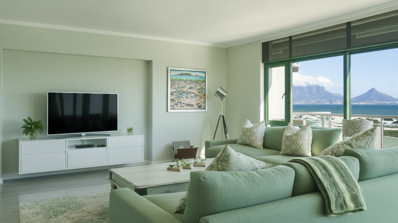
Green, on the other hand, is the great mediator. Because it is so dominant in the natural world, our brains process it as a sign of safety and balance.
Using green in your home, especially muted sage or olive tones, can reduce eye strain and promote harmony. It’s an excellent choice for shared living spaces or studies where you need sustained focus without the coldness sometimes associated with pure blue.
Consider the recent trend of bringing biophilic design indoors. This isn’t just about adding plants; it’s about acknowledging that the green spectrum is restorative.
If you are struggling to find stillness, introducing rich forest greens or soft moss tones can physically ground the space, offering a visual anchor in a chaotic world.
Yellow and orange: energy, risk, and provocation
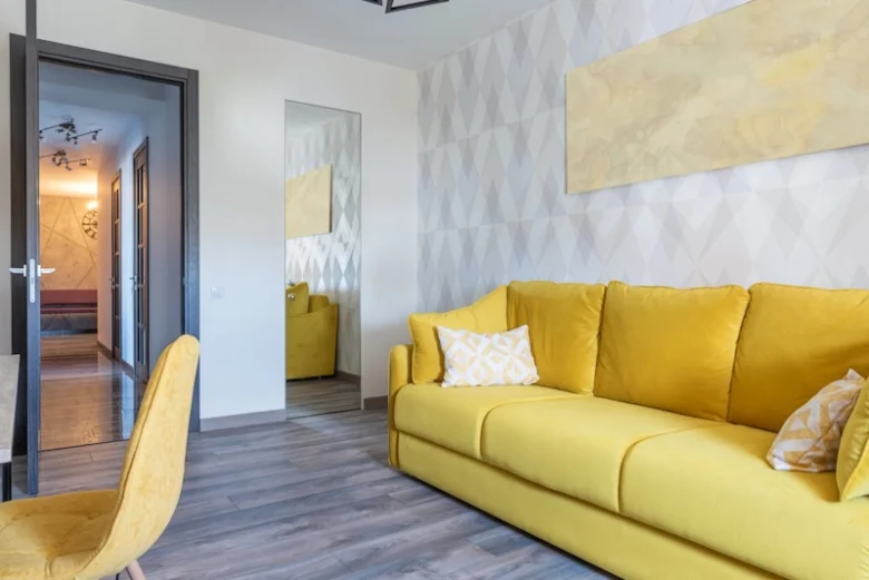
Yellow is the color of optimism and energy. It is the first color the human eye processes, which is why it often feels immediately uplifting and stimulating.
However, yellow is also the color of caution and high alert. When used excessively or in harsh, overly bright tones, it can become jarring, leading to irritation or anxiety.
The key to using yellow effectively in design is understanding its intensity. A soft, buttery yellow can make a small, dark hallway feel expansive and welcoming.
A vibrant, near-neon yellow, though, is a deliberate provocation—a choice for those who want their space to feel electric and slightly unsettling.
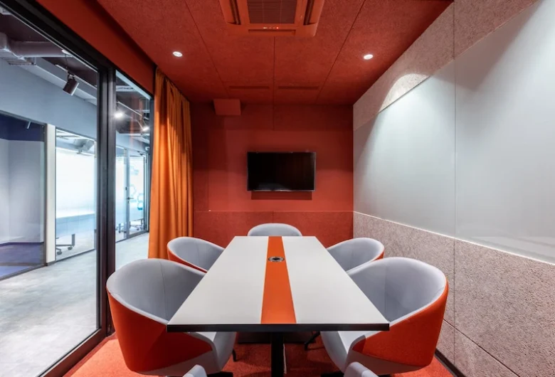
Orange takes the stimulating quality of red and tempers it with the happiness of yellow. It’s the color of warmth, conversation, and appetite.
This makes it a fantastic, if risky, choice for social spaces like dining rooms or kitchens. A touch of burnt orange in upholstery or art can inject immediate vitality without overwhelming the senses. When done right, these colors inspire creativity and connection.
Red and magenta: the pulse of desire and drama
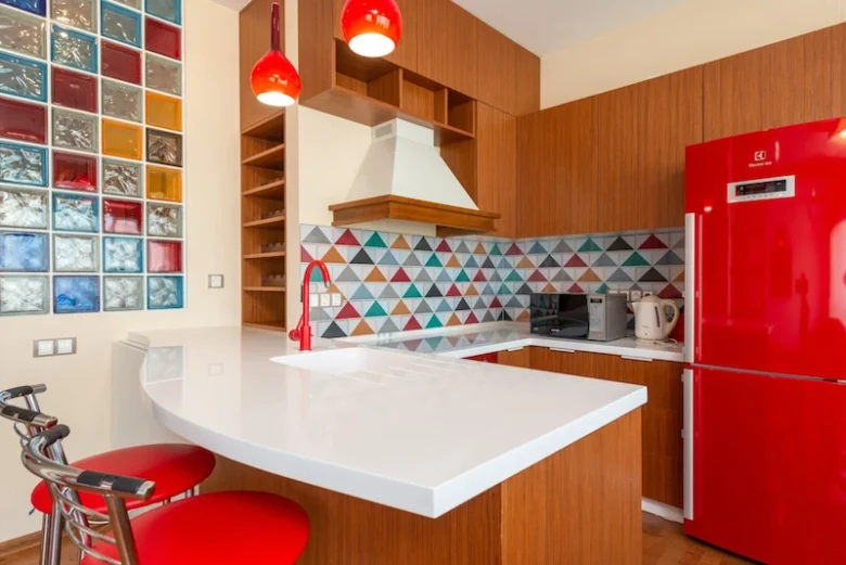
Red demands attention. Physiologically, red increases metabolism and respiration. It’s linked to passion, strength, and urgency.
In the context of the home, red is a high-stakes choice. If you want a space that feels dramatic, powerful, or intimate, a deep crimson or oxblood can achieve that.
However, red is rarely suitable for expansive surfaces in restorative spaces, like bedrooms, because its energy can interfere with rest.
Instead, think of red as an accent—a powerful visual cue. A single wall in a dining room, a piece of statement furniture, or a provocative art installation can use red to define the room’s emotional temperature.
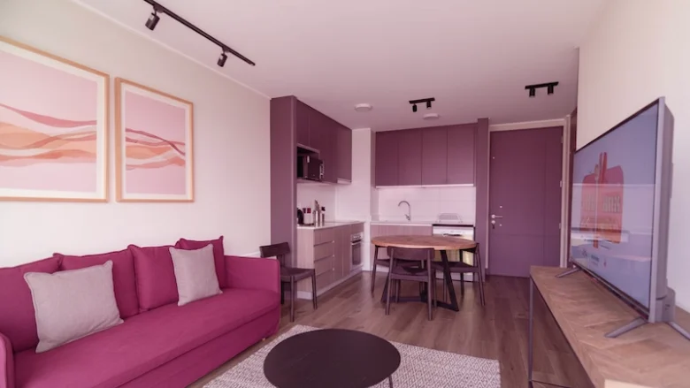
Magenta and deep pinks offer a nuanced take on red’s energy. These colors feel less aggressive and more sophisticated, embodying creativity and non-conformity.
They challenge traditional notions of gendered color, offering a vibrant, spiritual dimension. Using a rich magenta in a reading nook or as a backdrop for a curated art collection makes a statement about bold, intellectual curiosity.
Designing the narrative: color strategy for every room
The emotional function of a room should always dictate its color palette. A successful design strategy aligns the psychological effect of the color with the intended activity of the space. You wouldn’t use the same color to encourage deep sleep as you would to stimulate a brainstorming session.
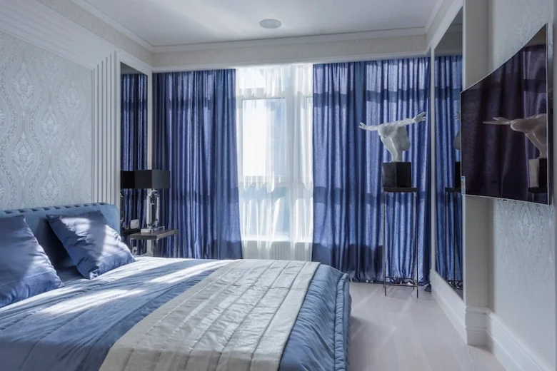
The bedroom: creating a restorative sanctuary
The bedroom is where we seek refuge and regeneration. The goal here is tranquility and emotional security. This means favoring cool, muted tones or soft, deep neutrals.
Colors like soft blues, dusty lilacs, or deep charcoals work well because they visually recede, helping to quiet the mind. If you prefer warmth, opt for complex, grounded neutrals like taupe, mushroom gray, or warm off-whites. These shades provide texture and depth without the high stimulation of bright colors.
One common mistake is using highly saturated warm colors, thinking they are cozy. While a fiery red might feel passionate, it can actually elevate your stress hormones, making it harder to fall asleep.
Stick to palettes that encourage the body to slow down.
| Room function | Recommended color palette | Psychological benefit |
|---|---|---|
| Bedroom / Rest | Soft blues, dusty purples, deep charcoal, warm gray | Tranquility, reduced stress, security |
| Home office / Focus | Muted greens, cool grays, light blues, complex neutrals | Concentration, clarity, stability |
| Dining room / Socializing | Burnt orange, deep terracotta, rich jewel tones (emerald, sapphire) | Appetite stimulation, conversation, warmth |
| Creative studio / Energy | Accents of bright yellow, magenta, white with strong primary contrasts | Optimism, stimulation, creativity |
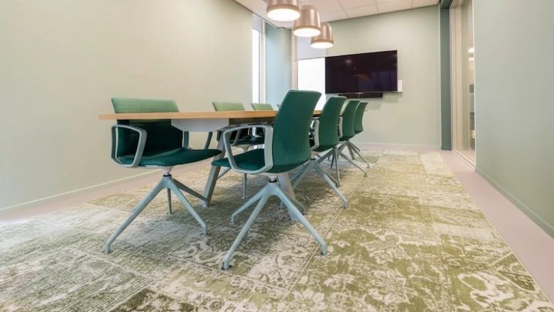
The home office: focused intensity without burnout
With many of us working from home, the office space needs to be a haven of efficiency. The color scheme here must support sustained attention and clear thinking.
Avoid colors that are too passive, like pale beige, which can lead to boredom, or colors that are too aggressive, which can cause fatigue. The sweet spot often lies in the middle: colors that provide stability and a connection to nature.
Muted greens are exceptional for an office because they balance focus with visual rest. Cool grays, when paired with rich wood textures, provide a sophisticated backdrop that minimizes distraction while maintaining professionalism.
If you need a touch of energy, use yellow sparingly in accessories or art, keeping the walls themselves grounded.
The strategic use of color in your workspace can significantly impact your output. You want a color that acts like a quiet, reliable partner, not a demanding boss.
Common areas: setting the social tempo
Living rooms, dens, and kitchens are the social hubs of the home. Here, the colors should foster connection, warmth, and conversation. This is where you can take more calculated risks with warmer tones.
Deep jewel tones—think rich emerald green, sapphire blue, or ruby red accents—are fantastic for creating an intimate, luxurious atmosphere. These colors feel enveloping and sophisticated, encouraging guests to settle in and talk.
If your style leans toward minimalism, using texture rather than high saturation is important. A monochromatic scheme built around various shades of white or gray can still feel warm if you layer materials like wool, linen, and aged wood. The absence of bold color becomes a statement of purity and refined taste.
When selecting colors for these shared spaces, consider the quality of light throughout the day. A color that looks vibrant in morning sunlight might appear flat and cold under evening lamps. Testing large swatches on different walls is key to ensuring the mood you set remains consistent.
Current currents: color trends that challenge and inspire
The world of contemporary design is always pushing boundaries, and the current trends in home color influence reflect a desire for authenticity and emotional depth, moving away from the bland, safe neutrals of the last decade.
We are seeing a powerful return to colors that feel historic, yet fresh, and often, beautifully unsettling.
Monochrome and the purity of intent
While bold colors are making a comeback, the monochromatic trend is evolving into something richer than simple white boxes.
Designers are exploring the purity of intent by using a single color family—often deep grays, rich browns, or complex earth tones—and relying entirely on texture, finish, and light to create interest.
This approach offers a profound sense of calm because the eye isn’t constantly jumping between contrasting hues. It allows the resident to focus on the form and the feeling of the space.
A room painted entirely in varying shades of terracotta, for example, becomes a sensory experience, a quiet monument to the beauty of simplicity.
This aesthetic choice is often a reflection of a desire to pare down the visual noise of modern life. It’s a sophisticated way to use color psychology in the home by promoting visual silence, which in turn, promotes mental clarity.
The return of saturated, unsettling palettes
The vanguard of design is currently embracing colors that are often labeled as “ugly” or “difficult.” We are seeing mustard yellows, muddy greens, oxblood reds, and deep purples used together in unexpected combinations.
This movement is less about matching and more about emotional resonance. These colors feel grounded, complex, and slightly melancholic.
They tell a story that is imperfect and human. A bold, deep teal paired with a muted rust accent is a choice that speaks to confidence and a rejection of mass-market aesthetics.
For those looking to adopt this aesthetic, the key is commitment. These saturated palettes work best when applied with confidence—either covering entire rooms or used in large blocks of color in furniture and textiles.
They create environments that feel less like transient spaces and more like intentional, curated worlds. This approach to design color strategy requires courage, but the emotional reward—a space that feels truly unique and provocative—is significant.
The art of color curation
Choosing the right colors for your home is an act of self-definition. It’s about deciding what kind of energy you want to cultivate and what kind of narrative you want your environment to tell.
Do you need a space that shelters you from the world, or one that electrifies your creative spirit?
The power of color is subtle, but relentless. It influences your morning routine, the quality of your rest, and the depth of your conversations.
As you consider your next design move, look beyond the swatch card. Ask yourself: What emotional risk am I willing to take? What story must this room tell?
This deeper understanding of how colors shape us is what separates mere decoration from true design. It’s about engaging with the visual world on a level that is both intellectual and deeply personal.
We encourage you to look at your surroundings not just as walls and furniture, but as a living canvas. Let the nuances of light and shade move you, reflect on the psychological proposal of every hue, and allow that inspiration to guide your aesthetic choices. When you engage with design in this way, your home becomes a powerful, curated statement about who you are.
We invite you to explore the latest works and aesthetic proposals featured in Neomania Magazine, where we constantly seek out the gestures, risks, and questions posed by the world’s most compelling architects and artists.
Let these stories transport you, reflect on the proposal aesthetic, and inspire you to consume culture and design of vanguard.


