When we talk about shifting the energy of a room, most people immediately think about rearranging furniture or maybe adding a new piece of art.
But the most immediate, visceral change you can make involves pure, unadulterated color. Specifically, we’re looking at color blocking in interiors—a technique that moves beyond simple accent walls to create spaces that are dynamic, defined, and deeply personal.
This isn’t about following fleeting trends. It’s about using geometry and intense chromatic tension to sculpt your environment. Color blocking is a powerful design choice that requires courage, but offers immense aesthetic reward.
It’s an approach that Neomania Magazine admires because it demands that we confront our relationship with space and light, forcing us to ask: What happens when boundaries blur, and what happens when they are sharply, intentionally drawn?
Why color blocking is more than just paint
At its heart, color blocking is an exercise in visual segmentation. It’s the intentional placement of large, solid fields of contrasting or complementary hues adjacent to one another.
Think of it less as decorating and more as spatial cartography, where each color defines a zone or mood.
This method pulls inspiration from fine art, particularly modernist movements and the geometric precision of artists like Piet Mondrian, but it brings that high-art energy right into your living room. The goal isn’t just to look good; it’s to feel defined.
Defining your aesthetic boundaries
A great space tells a story. Traditional design often seeks harmony through gentle transitions, but color blocking seeks drama through contrast.
When you apply a deep indigo block next to a vibrant tangerine stripe, you’re creating visual friction. This friction is what makes the space feel alive.
For professionals and young adults who spend hours working from home, color blocking offers a fantastic way to separate function visually.
A single wall in a studio apartment might be painted in two distinct colors—a muted olive green for the workspace and a calming terra cotta for the relaxation corner.
You haven’t added a physical wall, but you have clearly communicated the shift in purpose simply by altering the light and emotional register of the area.
This intentional use of color helps you manage your mental landscape. It creates a visual anchor, helping your brain transition between tasks or moods without the need for physical separation. It’s a subtle yet potent psychological tool.
Color blocking in interiors: The rules
Moving from concept to execution requires precision. Because color blocking is so direct, any misstep in color choice or placement becomes immediately obvious. You need a method that feels measured, even if the final result looks wildly spontaneous.
Choosing your palette: contrast versus complement
The effectiveness of color blocking rests entirely on the relationship between the colors you choose. You have two main routes to consider: high contrast or intentional complement.
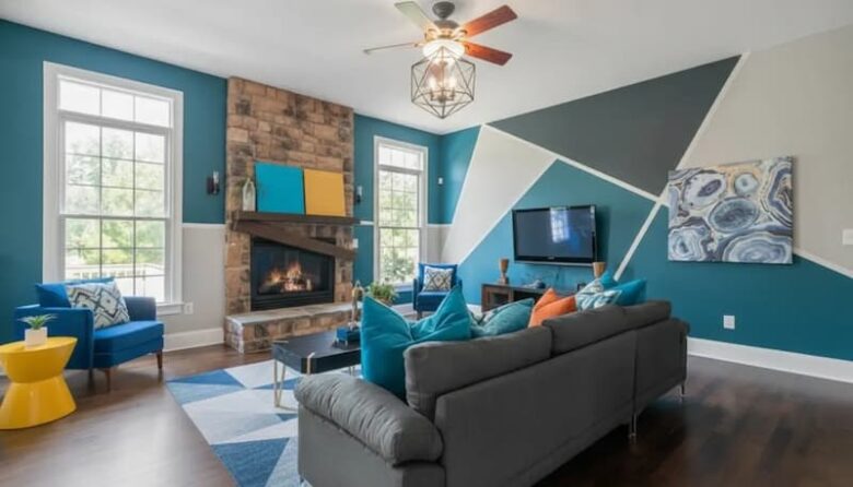
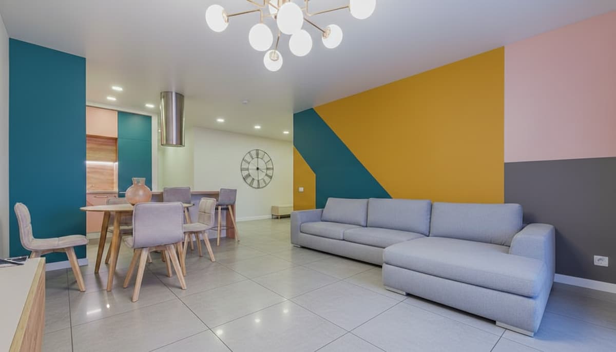
- High contrast (The provocateur): This is the most popular and often the most daring approach. It involves pairing colors that sit far apart on the color wheel, creating maximum visual tension. Think electric blue next to mustard yellow, or deep violet against lime green. This approach injects energy and modernity. When using high contrast, it helps to keep the surrounding elements (flooring, secondary textiles) relatively neutral so the blocks can truly sing.
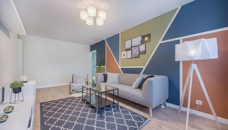
- Intentional complement (The refined statement): This route uses colors that are closer together but still distinct enough to define separate blocks. For example, pairing a muted dusty rose with a deep burgundy. This creates a sophisticated, layered look that feels softer and more textural, even though the colors themselves are flat. This works beautifully in older homes or spaces where you want depth without overwhelming boldness.
A good starting point is the 60-30-10 rule, but applied to color fields rather than general room elements. You might assign 60% of the wall space to your main block color, 30% to the contrasting block, and 10% to a neutral boundary or trim color. This ratio ensures balance even when working with highly saturated hues.
Scale and placement: where the blocks belong
The beauty of this technique is its flexibility. A “block” doesn’t have to be a full wall. It can be a horizontal stripe running midway up a wall, creating the illusion of a wainscoting effect but with a contemporary twist.
Or maybe it’s a vertical column of color used to highlight a specific architectural feature, like a fireplace or a bookshelf.
When deciding on placement, think about how light interacts with the space throughout the day. A color block placed high on a wall near a window will look drastically different than the same color applied low to the ground.
For a dramatic, gallery-like effect, consider painting the ceiling a color that contrasts sharply with the top third of the wall. This pulls the eye upward and changes the perceived height of the room—a spatial trick that feels both spiritual and deeply architectural.
We recently saw a designer use this method in a Brooklyn loft, applying a massive, irregular trapezoid of deep forest green that seemed to bleed across the ceiling and down one corner of the adjoining wall.
It wasn’t symmetrical, and that was the point. It felt like the space itself was being stretched and questioned.
Beyond the walls: applying color blocking to furniture and textiles
Color blocking doesn’t stop at the paint can. To achieve a truly cohesive and provocative interior, you need to extend this philosophy to the objects within the space. This is where the design becomes tactile and layered.
If your walls are relatively neutral, let the furniture do the heavy lifting.
- The sectional sofa: Instead of buying a single-color sectional, look for pieces that utilize two different, bold fabrics—perhaps a velvet chartreuse on the base cushions and a textured sapphire on the backrests. This turns the furniture into a sculptural color piece.
- Layered textiles: Use area rugs that feature geometric color divisions. Stack throw pillows in solid, non-patterned, contrasting colors (e.g., bright coral and electric yellow) on a neutral sofa. This allows you to introduce the dynamic energy of color blocking without permanent commitment.
Architectural sculpting with paint
Sometimes the most effective way to use contrasting color is to treat existing features as distinct blocks. Doorways, window frames, and archways become opportunities for sharp, graphic definition.
Consider painting the interior side of a door a radically different color than the wall it sits on. When the door is closed, it’s a seamless wall; when it’s open, the unexpected flash of color frames the adjacent room, creating a momentary visual shock. This is a subtle yet powerful technique that plays with movement and perception.
Another powerful application involves painting the trim (baseboards and crown molding) in a highly saturated color, while the main wall remains a light neutral.
Traditionally, trim is painted white to blend in. By making it stand out, you give the room a rigid, almost graphic border, emphasizing the edges and the contained volume of the space.
Psychological architecture: how color blocking changes the feeling of a room
Color is never just visual; it’s vibrational. The way we perceive space is deeply tied to the temperature and intensity of the colors around us.
Color blocking exploits this link, allowing you to manipulate the mood and even the perceived temperature of a space.
Warm colors (reds, oranges, yellows) tend to advance, making the surface feel closer. Cool colors (blues, greens, violets) tend to recede, making the surface feel farther away.
By positioning these colors strategically, you can play tricks on the eye, making a long, narrow hallway feel wider, or a cavernous room feel cozier.
If you have a very tall ceiling, using a deep, warm color block on the upper third of the wall and ceiling helps “lower” the visual height, creating an enveloping, intimate atmosphere.
Conversely, if you want to expand a small room, use lighter, cool colors across adjacent walls, with a vertical block of saturated color used only on the wall you want the eye to be drawn to first. This acts as a focal point without closing the space down.
This method forces you to be intentional about the emotional landscape you are building. It asks you: Do you want a space that feels energized and provocative (high contrast, warm colors) or one that feels introspective and grounded (intentional complement, cool colors)? The blocks become markers of your chosen emotional state.
Common mistakes and how to refine your vision
While the process is straightforward, the execution requires a refined eye. A few common pitfalls can turn a sophisticated color-blocked space into something jarring or chaotic.
One frequent issue is over-saturation. If every wall, every piece of furniture, and every textile is screaming with intense color, the effect is lost.
Color blocking works best when the bold statements are balanced by areas of visual rest. Make sure you incorporate neutral surfaces—maybe a raw wood floor, a white ceiling, or a large, simple rug—to give the eye a place to breathe between the blocks of intensity.
Another mistake is neglecting the transitions. You might be tempted to simply tape off a line and paint. But if the colors meet abruptly in the middle of an empty wall, the effect can feel unfinished.
Consider using the color block to define the edge of something, like a piece of art, a window, or the frame of a mirror. This gives the color a purpose beyond its own existence.
For instance, instead of painting a random square on a wall, try extending the color block down to the floor, creating a continuous band of color that visually anchors the space.
Or, paint a block of color that precisely frames a piece of furniture, like a dining hutch or a reading chair. This makes the furniture and the color feel inseparable, elevating the entire composition.
We also see instances where people use too many colors at once. Limiting your palette to two or three primary colors (plus neutrals) maintains the graphic power of the technique.
Once you introduce four or five distinct hues, the space starts to look busy rather than blocked. Keep it sharp; keep it focused.
The Neomania perspective: living boldly through design
In the world of design, true innovation often lies in the courageous use of simple elements. Color blocking is a testament to this idea. It’s not about expensive materials or complicated installations; it’s about making decisive, aesthetic choices that alter how you perceive and interact with your daily environment.
This approach challenges the status quo of safe neutrals and predictable palettes. It asks you to make a statement about geometry, about tension, and about your own willingness to live in a visually charged space.
It’s provocative, yes, but in the most satisfying way—it forces reflection every time you walk into the room.
If you’re ready to redefine your space with this kind of audacious geometry, and if you find yourself constantly seeking design ideas that are spiritual, challenging, and aesthetically refined, then you already understand the Neomania ethos.
We offer a direct look at the risks and the rewards of contemporary culture, from art and architecture to the deeper psychological currents that shape our lives.
We invite you to explore more of our refined narratives, to reflect on the aesthetic proposals we present, and to find inspiration that goes beyond traditional criticism.
Subscribe to Neomania Magazine today and let us transport you to the cutting edge of design and culture.


