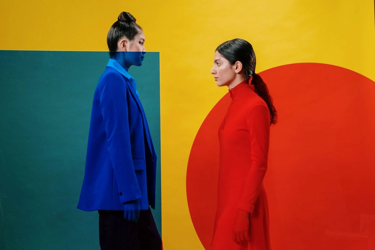
In a world saturated with minimalist aesthetics—a sea of muted greys, sensible beiges, and clean, predictable lines—a quiet revolution is taking place. It’s a rebellion of color, a riot of pattern, and a celebration of shapes that refuse to be ignored.
This movement feels fresh, vibrant, and distinctly of the moment, yet its roots stretch back four decades to a group of Italian designers who decided that “good taste” was, frankly, a bit boring.
We’re talking about the resurgence of a design language that once shocked the world and is now returning to challenge our contemporary sensibilities. This is more than just a trend; it’s a statement about joy, individuality, and the courage to be different.
The return of this playful, postmodern aesthetic is not a simple act of nostalgic revivalism. It’s a reinterpretation, a conversation between the past and the present. The original movement was a direct, almost aggressive, response to the austerity of modernism.
Today, its comeback speaks to a different kind of need: a desire for optimism, personality, and human touch in our increasingly digitized and homogenized environments. It’s an aesthetic that feels inherently optimistic, a visual antidote to cynicism.
As we explore the Contemporary Memphis style, we aren’t just looking at furniture and decor; we are examining a cultural shift. We’re asking what it means when a society, after a long affair with an understated look, begins to crave the loud, the eccentric, and the wonderfully impractical.
It’s in these questions that we find the most compelling stories, the ones that reveal who we are and what we value today. This is the kind of analysis we cherish at Neomania Magazine, where we believe that design is never just about how things look, but about the ideas and emotions they provoke.
The rebellious roots of a design revolution
To understand where this vibrant design language is going, we must first understand where it came from. The story begins in Milan in the late 1970s and early 1980s, a period when design was largely governed by the strict, sober principles of modernism.
The prevailing ethos was that form should follow function, that ornamentation was a crime, and that a neutral, rational approach was the pinnacle of sophistication. It was a world of sleek leather, polished chrome, and an almost dogmatic belief in minimalism.
While beautiful in its own right, this approach left little room for humor, emotion, or outright fun. It was against this backdrop of serious, high-minded design that a group of creatives decided to throw a wrench in the works.
A world of beige: reacting against ‘good taste’
The late 20th century was a period of immense social and cultural change, yet mainstream design often felt stuck in a loop of its own self-imposed rules. The modernist project, born from a utopian desire to create a better world through rational design, had, in the eyes of some, become a creative straitjacket.
The emphasis on industrial materials, mass production, and a universal aesthetic had led to a certain uniformity. Homes, offices, and public spaces began to look increasingly similar, dominated by a palette that ranged from eggshell to taupe.
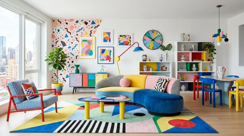
This was the era of “good taste” as defined by a select group of critics and tastemakers. It was a taste that valued restraint, subtlety, and a kind of intellectual coolness.
But a new generation of designers was growing restless. They felt that this obsession with functionalism and minimalism had stripped design of its soul. Where was the personality? Where was the joy? Where was the acknowledgment that life is messy, chaotic, and often irrational?
They saw the prevailing aesthetic not as sophisticated, but as sterile and emotionally vacant. They yearned for a visual language that could reflect the complexity and contradictions of modern life.
This wasn’t just a stylistic disagreement; it was a philosophical one. It was a rejection of the idea that there was a single, correct way to design or to live. They wanted to create objects that were not just useful, but also communicative, objects that told a story, provoked a reaction, and maybe even made you smile.
This simmering discontent was the fertile ground from which one of the most audacious design movements of the century would spring.
The Milanese gathering that changed everything
The legend goes that on the evening of December 11, 1980, a group of young designers gathered in the Milan apartment of Ettore Sottsass, a towering figure in Italian design who was himself growing tired of the modernist establishment.
The Bob Dylan song “Stuck Inside of Mobile with the Memphis Blues Again” was playing on repeat. From that serendipitous moment, the Memphis Group was born.
The name itself was a perfect encapsulation of their ethos: it was ambiguous, referencing both the ancient capital of Egypt and the birthplace of rock and roll in Tennessee. It was high-culture and low-culture, ancient and modern, all rolled into one.
Sottsass, along with other key figures like Michele De Lucchi, Martine Bedin, and Nathalie Du Pasquier, formed a collective that was less a formal company and more a band of creative insurgents. Their goal was radical: to dismantle the established hierarchies of design.
They wanted to blur the lines between art and object, to challenge the notion of luxury, and to reintroduce color, pattern, and ornament into the vocabulary of contemporary design. Their debut at the 1981 Salone del Mobile in Milan was an explosion of a show.
The world of design, accustomed to quiet elegance, was suddenly confronted with wildly colored cabinets, asymmetrical bookcases, and chairs that looked more like abstract sculptures. The reaction was immediate and polarized. Some critics were horrified, calling it kitsch and vulgar.
Others were electrified, seeing it as a long-overdue breath of fresh air. The group had achieved its goal: it had started a conversation and, in doing so, had irrevocably altered the course of design history.
The visual language of defiance
The aesthetic of the original Memphis movement was a deliberate and calculated assault on convention. It was built on a foundation of breaking every rule it could find. If “good taste” dictated natural materials, they would use plastic laminate and cheap industrial finishes.
If modernism demanded clean lines and right angles, they would embrace jaunty diagonals, curves, and nonsensical shapes. If the prevailing wisdom was a muted color palette, they would clash primary colors with neons and pastels, often all in the same piece.
The core components of their visual language were unmistakable and revolutionary for their time. They drew inspiration from a dizzying array of sources, mashing them together without concern for historical purity. Art Deco, Pop Art, 1950s kitsch, and futuristic sci-fi all found their way into the Memphis melting pot.
One of the most iconic elements was the “Bacterio” print, a squiggly, organic pattern developed by Sottsass that looked like a microscopic view of germs, which they gleefully applied to furniture surfaces.
Terrazzo, a composite material traditionally used for flooring, was suddenly elevated to become the surface for tables and lamps. Their forms were often intentionally non-functional, prioritizing visual impact over practical utility.
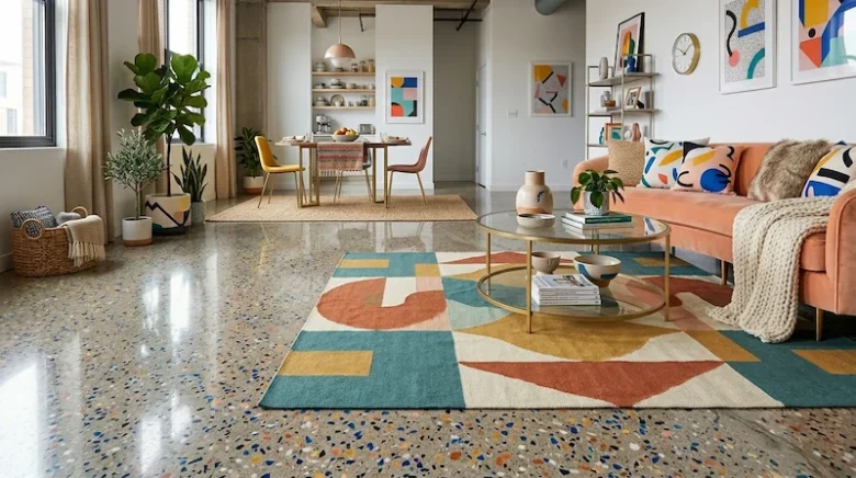
A bookcase might have shelves tilted at unusable angles, and a chair might be more of a statement piece than a comfortable place to sit. This was the point. They were creating objects of communication.
They were using the language of design to ask questions, to provoke, and to declare that the world of objects could be a playground for the imagination.
From postmodern relic to digital-age icon
For a time, the Memphis look was everywhere. It defined the visual culture of the 1980s, influencing fashion, music videos, and graphic design. But like many radical movements, its time in the mainstream was short-lived. By the early 1990s, the aesthetic began to feel dated, a caricature of a decade known for its excess.
The design world swung back in the other direction, embracing a new wave of minimalism that was even more austere than the one Memphis had rebelled against. For nearly two decades, the movement was often dismissed as a gaudy, regrettable fad.
Yet, something fascinating happened in the 2010s. The squiggles, the clashing colors, and the bold geometry began to creep back into our visual landscape, not as a joke, but as a source of genuine inspiration.
The fall and rise of radical design
The initial decline of the Memphis aesthetic can be attributed to its own success and intensity. It was a style so potent and so specific to its time that it quickly became over-saturated. Its very boldness made it difficult to live with long-term, and its association with the 1980s became a liability as culture moved on.
The design pendulum swung hard towards a more sober, organic, and “authentic” aesthetic. The 1990s and 2000s were dominated by Scandinavian simplicity, industrial chic, and a focus on natural materials like reclaimed wood and raw concrete. In this context, the plastic laminates and cartoonish shapes of Memphis seemed frivolous and inauthentic.
However, trends are cyclical. A new generation, one that had no firsthand memory of the 1980s, began to rediscover the movement. They saw it not as dated, but as exciting, daring, and refreshingly optimistic.
They were drawn to its unapologetic use of color and its playful spirit. In a world that often felt anxious and uncertain, the unbridled joy of the Memphis look offered a sense of escape and possibility.
This revival was also fueled by a growing fatigue with the very minimalism that had replaced it. After years of living in carefully curated, neutral spaces, people began to crave personality, individuality, and a bit of controlled chaos. The radical design of the past was no longer a relic; it was a roadmap for a more expressive future.
The Instagram effect: how a visual culture resurrected a movement
A crucial catalyst for this revival was the rise of social media, particularly visually-driven platforms like Instagram and Pinterest. The core tenets of the Memphis aesthetic are, in many ways, perfectly suited for the digital age.
In a feed filled with an endless stream of images, what stands out? Bold colors, graphic patterns, and strong, unconventional shapes. The movement’s designs are inherently “scroll-stopping.”
They are photogenic, instantly communicating a sense of energy and creativity. A single piece of furniture or a well-placed decorative object designed with these principles can transform a simple photo into a compelling visual statement.
This created a powerful feedback loop. Designers and influencers began incorporating elements of the style into their work and their homes, sharing images that quickly gained traction online.
This exposure introduced the aesthetic to a massive global audience who may have never encountered it in a design museum or history book. They saw it as something new and exciting, untethered from its original, often academic, context. Furthermore, the digital world allows for a more democratic and piecemeal adoption of the style.
You don’t have to commit to an entire room of clashing furniture. You can simply appreciate a well-composed photo, buy a single graphic art print, or use a colorful filter inspired by the look.
Social media decontextualized the movement, freeing it from its historical baggage and allowing it to be reborn as a purely visual and joyful trend for a new era.
The 2020s remix: what’s different this time?
While the spirit of the original movement is very much alive, its contemporary interpretation is not a carbon copy. The new wave is more of a remix than a faithful reproduction.
Today’s designers and consumers are approaching it with a modern sensibility, picking and choosing elements and blending them with other styles. The result is a look that is often more refined, curated, and easier to live with than its 1980s predecessor.
Several key differences mark this modern interpretation. Firstly, there’s a significant shift in materiality. While the original group celebrated artificial materials like plastic laminate, the revival often incorporates more luxurious and natural textures.
Think terrazzo made with high-end stone, velvets and bouclés on sofas with geometric silhouettes, and powder-coated metals paired with light-toned woods. This grounds the playful forms with a sense of quality and permanence. Secondly, the application is different.
The 1980s approach was often about total immersion, creating entire environments that were a sensory overload. The contemporary approach is more about the power of the accent.
It’s about using one or two bold pieces—a statement chair, a sculptural lamp, a graphic rug—to inject personality into an otherwise more restrained space. Here’s a quick look at the evolution:
- The 1980s Original:
- Materials: Plastic laminate, chrome, inexpensive industrial materials.
- Palette: Loud primary colors, neons, stark black-and-white contrasts.
- Application: Full-room, immersive environments.
- Philosophy: A radical, intellectual critique of modernism.
- The 2020s Revival:
- Materials: Terrazzo, velvet, powder-coated steel, natural wood, glass.
- Palette: Softer pastels (like millennial pink and sage green) mixed with bold, saturated accent colors.
- Application: Statement pieces and accents within a more eclectic or minimalist space.
- Philosophy: A pursuit of joy, self-expression, and visual optimism.
This modern remix is less about a rigid ideology and more about a feeling. It’s about borrowing the movement’s most joyful and liberating ideas and adapting them to the way we live now.
Deconstructing the new Memphis aesthetic
Embracing the spirit of this revived design movement doesn’t require turning your home into a 1980s time capsule. The beauty of its current iteration lies in its flexibility. It’s about understanding the core principles—the interplay of color, the celebration of form, and the importance of texture—and then applying them in a way that feels personal and authentic.
It’s a design language that encourages you to play, to experiment, and to trust your own instincts rather than adhering to a strict set of rules. This is precisely the kind of creative exploration our team champions, looking beyond the surface of a trend to understand its underlying grammar and potential.
The evolution of the color palette
Color is, without a doubt, the most immediate and impactful element of this style. The original Memphis palette was famously audacious, a high-contrast mix of primary colors like canary yellow and fire-engine red, often set against graphic black-and-white patterns. It was designed to be jarring and to grab your attention.
While that boldness is still a key ingredient, the contemporary palette is more nuanced and sophisticated. It reflects a decade of color trends that have leaned towards softer, more livable hues.
The modern interpretation often starts with a base of more muted, sophisticated colors. Think dusty rose, sage green, terracotta, or a deep mustard yellow. These provide a warm and inviting foundation that feels contemporary. The classic Memphis energy is then injected through strategic pops of highly saturated color.
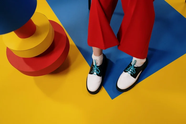
A muted green sofa might be paired with a single, brilliant cobalt blue cushion. A room with soft pink walls could be anchored by a bright yellow side table. This approach creates a dynamic tension between the calm and the chaotic, the subtle and the loud.
It allows the bold colors to have an even greater impact because they are used more sparingly. The stark black-and-white graphic elements also remain crucial, often appearing in textiles, rugs, or art, serving as a visual anchor that ties the disparate colors together. The key is balance; it’s a palette that feels both joyful and considered, energetic and livable.
A new sense of materiality
The original Memphis designers had a fascination with materials that were considered “low-brow” or artificial. Plastic laminate, in particular, was a favorite because it was democratic, colorful, and a direct rejection of the “noble” materials like solid wood and marble that were prized by the modernist establishment.
Today, while the love for bold surfaces remains, there has been a significant shift in the materials used to achieve the look. The contemporary Contemporary Memphis style is far more tactile and materially rich.
Terrazzo is a perfect example of this evolution. Once a humble flooring material, it has been elevated to a luxury finish, used for everything from kitchen countertops to high-end tabletops and decorative objects.
Its composite nature, with chips of marble, quartz, or glass set in a binder, creates a playful, patterned surface that feels both organic and graphic—a perfect fit for the aesthetic.
We also see a greater emphasis on soft, textured fabrics. Sofas and chairs with bold, geometric shapes are now frequently upholstered in plush velvets, nubby bouclés, or other textiles that invite touch. This adds a layer of comfort and warmth that was often absent in the harder-edged originals.
Metals are also used differently. Instead of the polished chrome of the 80s, we see more powder-coated steel in matte finishes and a rainbow of colors, which gives a softer, more contemporary feel. This fusion of playful forms with high-quality, tactile materials is what makes the current revival feel so fresh and appealing.
Mastering the accent: bringing the spirit into your space
Perhaps the most practical way to engage with this trend is to think of it not as an all-or-nothing proposition, but as a toolkit for injecting personality and joy into your environment. The “total look” of the 1980s can be overwhelming, but using individual elements as focal points can be incredibly effective.
This approach allows you to capture the rebellious and optimistic spirit of the movement without sacrificing comfort or livability. It’s about creating moments of surprise and delight within your space.
The goal is to choose one or two statement pieces that embody the aesthetic and let them shine. This could be a sculptural floor lamp with a quirky shape, an armchair with a bold geometric pattern, or a coffee table with an unusual color combination.
These pieces act as functional art, starting conversations and adding a layer of creative energy to the room. Another accessible entry point is through textiles and accessories.
A set of graphic cushions, a rug with a bold, asymmetrical pattern, or a collection of colorful ceramic vases can instantly transform the feel of a space. Here are a few ideas for incorporating the look in a measured way:
- Start with art: A large, graphic art print with bold colors and shapes is one of the easiest ways to test the waters.
- Focus on a single piece of furniture: Invest in one item, like a colorful accent chair or a unique side table, and keep the rest of the room relatively simple.
- Play with lighting: A sculptural lamp with a geometric base or a colorful shade can serve as a perfect focal point.
- Use textiles to your advantage: Rugs, pillows, and throws are low-commitment ways to introduce pattern and color.
By using these elements as accents, you are not recreating a historical style; you are borrowing its confidence and its sense of fun. You are making a personal statement that your home is a place for expression, creativity, and a little bit of joyful rebellion against the mundane.
This design movement, in its original and revived forms, is a powerful reminder that our surroundings have a profound impact on our mood and our mindset. It champions the idea that design should not just be functional, but also emotional, provocative, and deeply human. It gives us permission to break the rules, to embrace color, and to create spaces that are a true reflection of our own unique personalities.
The story of this aesthetic’s journey from radical outlier to celebrated icon is about more than just changing tastes in furniture. It’s a narrative about our collective desire for optimism, expression, and connection in a complex world. It challenges us to look at the objects we live with and ask if they bring us joy.
If you are drawn to narratives that provoke thought and aesthetics that stir the soul, then our collection of stories awaits. Subscribe to Neomania Magazine and join a conversation that goes beyond the surface, into the very heart of creative expression.