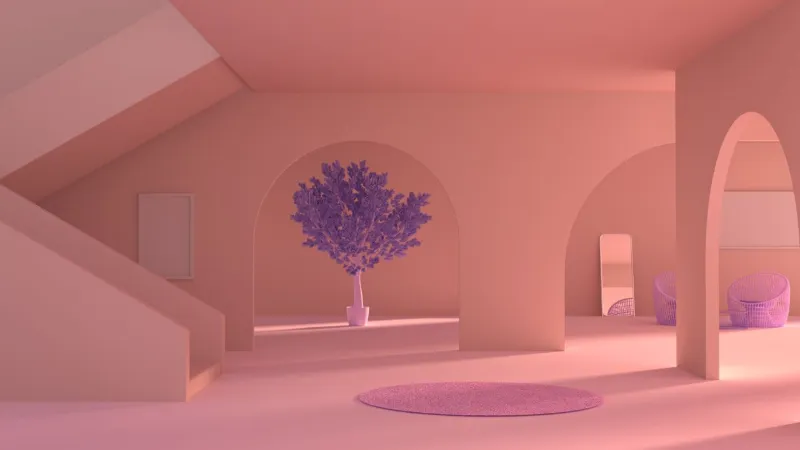
The stark white gallery wall, a long-reigning symbol of minimalist chic and artistic purity, is beginning to feel less like a canvas for life and more like a creative void. For decades, the conventional wisdom in design has been to paint walls a neutral shade white, beige, or a soft gray, to make a space feel larger, brighter, and serve as a quiet backdrop for art and furniture.
This approach, rooted in modernist principles, treats the room as a container. But what if the container itself became the experience? What if walls, ceilings, trim, and even furniture were not just surfaces, but a singular, unified statement? This is the core question posed by one of the most compelling shifts in contemporary interior design: the move toward total chromatic immersion.
This is not merely about painting a room a bold color. It’s a holistic philosophy that challenges our perception of space, light, and emotion. By wrapping an entire room in a single, uninterrupted hue, designers and homeowners are creating environments that are deeply personal, psychologically resonant, and aesthetically audacious.
The technique, often referred to as colour drenching, dissolves the architectural lines that typically define a room, the corners where walls meet, the boundary between wall and ceiling, the interruption of a door frame. In their place, a seamless, cocoon-like environment emerges.
It’s a move away from decorating a room to truly inhabiting it, transforming a collection of surfaces into a cohesive, emotive world. This approach demands a certain confidence, a willingness to commit fully to a vision, and an understanding that color can do more than just adorn; it can define.
Deconstructing the monochromatic space
At its heart, the concept of a single-color environment is about creating a powerful atmospheric shift. It’s a rebellion against the piecemeal approach to design, where each element is chosen in isolation. Instead, it advocates for a unified field of vision where the sum is profoundly greater than its parts.
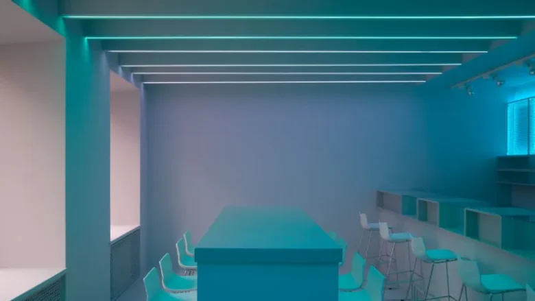
This isn’t a new idea—historic homes often featured rooms with matching walls, textiles, and upholstery—but its modern interpretation feels fresh and radical. It’s less about period-specific opulence and more about a contemporary desire for spaces that feel intentional, curated, and emotionally enveloping.
The dissolution of architectural boundaries
The most immediate effect of applying a single color to every surface is the softening of a room’s geometry. Traditionally, a white ceiling is used to create a sense of height, and contrasting trim is meant to frame and define architectural features like windows and doors. The drenching paint trend deliberately subverts these rules.
When the ceiling is the same colour as the walls, the hard line where they meet disappears. The eye is no longer drawn upward to a stark white plane, but is instead allowed to travel seamlessly around the space. This can make a room feel both larger and more intimate simultaneously.
The boundaries expand into a continuous field of color, creating a sense of infinite depth, while the uniform hue cocoons the inhabitant, fostering a feeling of security and calm.
Consider a small study or reading nook. Painted in a deep, moody blue—from the baseboards to the ceiling, including the built-in bookshelves—the room transforms. The corners recede, and the space becomes a sanctuary for focus and contemplation.
The books on the shelves, the texture of a velvet armchair, and the warm glow of a brass lamp become the focal points, their colors and forms intensified by the unified backdrop. The room is no longer just a small box; it’s a world unto itself.
Light, shadow, and the texture of color
A monochromatic room is a masterclass in the interplay of light and shadow. When a single color covers multiple surfaces with different orientations and textures, it reveals its incredible complexity.
The same shade of sage green will appear different on a smooth wall, a matte ceiling, a semi-gloss door, and the nubby fabric of a sofa. Light from a window will catch a wall and render it several shades lighter, while the same color in a shadowed corner will deepen into a mysterious, richer version of itself.
This is where the magic truly happens. The room becomes a dynamic canvas, constantly changing with the time of day and the quality of light. It’s a subtle, living art installation.
This effect is amplified by the choice of paint finish. A popular technique involves using different sheens of the same color to create subtle variation and interest:
- Matte or flat: Ideal for walls and ceilings, this finish absorbs light and creates a soft, velvety look that hides imperfections and enhances the feeling of being enveloped.
- Eggshell or satin: Often used for trim, doors, and cabinetry, this finish has a slight sheen that catches the light, subtly defining architectural details without breaking the monochromatic scheme.
- Semi-gloss or high-gloss: Reserved for dramatic effect, a high-gloss finish on a ceiling or a feature piece of furniture can create a lacquered, reflective surface that adds a layer of glamour and sophistication, bouncing light around the room in unexpected ways.
By layering these finishes, you create a rich, textural landscape that is anything but boring. The single color becomes a spectrum of itself, revealing nuances that would be lost in a more traditional, multi-hued space.
The emotional architecture of a single hue
Choosing to immerse a space in one color is as much an emotional decision as it is an aesthetic one. It’s about curating a feeling, crafting a specific psychological atmosphere.
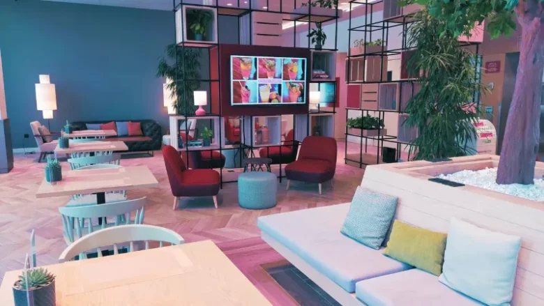
A room drenched in a particular hue can profoundly influence mood and perception, turning a simple living space into an active participant in one’s daily life. This is where the practice transcends being a mere trend and becomes a powerful tool for personal expression and well-being. It’s about designing a space that doesn’t just look a certain way, but feels a certain way.
Crafting sanctuaries: the color drenching bedroom
Perhaps no room is better suited for this immersive approach than the bedroom. As our most private and personal sanctuary, the bedroom is where we begin and end our day. Creating a cocoon of color here can have a powerful impact on our ability to rest and recharge.
A color drenching bedroom, wrapped in a calming, unified hue, can feel like a protective embrace, shutting out the noise and chaos of the outside world. Think of a room swathed in a dusty rose or a deep terracotta. When the walls, ceiling, curtains, and even the headboard share the same color family, the visual clutter is eliminated.
The mind is not busy processing contrasting lines and shapes; it is free to settle. The focus shifts from the room’s architecture to the feeling it evokes: tranquility, warmth, and security.
This approach also allows for a sophisticated layering of textures. In a bedroom drenched in a soft, earthy green, you can introduce a linen duvet, a chunky knit throw, a velvet cushion, and a raw silk lampshade—all in varying shades of the same green.
Each material interacts with light differently, creating a rich tapestry of tactile and visual interest. The result is a space that feels deeply personal and incredibly luxurious, not because of overt opulence, but because of its thoughtful, cohesive, and sensory-rich design.
Beyond the bedroom: public spaces with a point of view
While the bedroom is a natural starting point, the power of a single-color environment can be harnessed in any room to create a specific mood or function. A dining room, for example, can be transformed into a dramatic and intimate setting for entertaining when enveloped in a rich, saturated color like aubergine or charcoal gray.
With the ceiling same as walls, the space feels boundless yet intimate, encouraging conversation to flow. The glow of candlelight or a modern chandelier would reflect beautifully off the unified surfaces, creating a mesmerizing, restaurant-like ambiance.
Even functional spaces like home offices or libraries can benefit. A home office drenched in a focused, intellectual shade of navy or forest green can minimize distractions and foster concentration. By painting the walls, built-in shelving, and trim the same color, the usual visual noise of a workspace is quieted.
The focus shifts to the task at hand, supported by an environment that feels intentional and orderly. It’s a design strategy that aligns the physical space with its intended purpose, creating an architecture of emotion and function.
Navigating the bold and the subtle
The success of a single-color room hinges on choosing the right hue. This isn’t about picking a favorite color from a paint chip; it’s about understanding how that color will behave in a specific space, with its unique lighting and proportions.
Bold, saturated colors like cobalt blue or emerald green can create incredibly dynamic and energizing spaces, perfect for a creative studio or a vibrant living room. However, they require confidence and careful consideration of the room’s natural light. In a room with little natural light, a dark, saturated color can feel oppressive if not balanced with excellent artificial lighting and reflective surfaces.
Conversely, softer, more muted tones can be just as impactful. A room bathed in a pale, chalky clay or a warm, sandy beige can feel serene, airy, and sophisticated. These lighter, desaturated colors are often easier to live with and provide a versatile backdrop for art and furnishings.
They create a sense of calm and cohesion without overwhelming the senses. The key is to select a color with enough depth and complexity to remain interesting when applied everywhere.
A flat, primary color might feel simplistic, but a color with subtle undertones—a gray with a hint of green, a white with a touch of pink—will reveal new facets of itself throughout the day.
Execution and material considerations
Committing to a single-color environment is a bold move, and its success lies in the details of its execution. It’s not as simple as buying gallons of the same paint and applying it everywhere. A truly immersive space requires careful thought about texture, finish, and the integration of other materials.
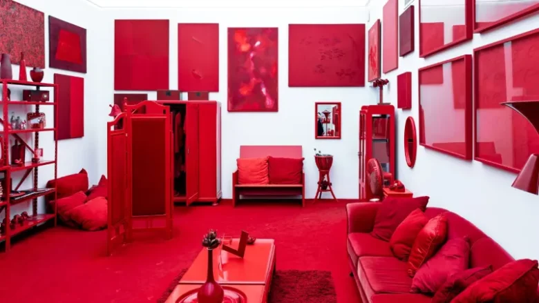
The goal is to create a room that feels layered and sophisticated, not flat and one-dimensional. This is where the artistry of the approach comes to life, moving beyond a simple paint trend to become a comprehensive design philosophy.
The art of layering sheens and textures
As mentioned earlier, varying the paint finish is a crucial technique for adding depth to a monochromatic room. But this layering of textures should extend beyond the paint itself. To prevent the space from feeling monotonous, it’s vital to introduce a variety of materials that share the same color family but offer different tactile experiences. Imagine a living room drenched in a warm, greige tone.
The walls are a flat matte, the trim is a subtle satin. Now, add a sofa upholstered in a greige bouclé fabric, a low-pile wool rug in a slightly darker shade, and linen curtains that filter light beautifully. A marble coffee table with gray-beige veining and ceramic vases with a rough, sandy texture complete the picture.
Each of these elements contributes to the overall color story, but their distinct textures create a rich, sensory experience. The eye and hand can travel around the room, appreciating the softness of the bouclé, the coolness of the marble, and the rustic feel of the ceramics. This material diversity is what gives the room its soul and prevents it from feeling sterile. It’s a celebration of the chosen color in all its potential forms.
Integrating contrasting elements with intention
A single-color room does not have to be entirely devoid of other colors. In fact, small, intentional moments of contrast can be incredibly powerful, their impact amplified by the unified backdrop. The key is to treat these contrasting elements as deliberate artistic statements rather than random additions.
In a room enveloped in a deep, inky blue, a single piece of furniture in a vibrant ochre or a piece of art with flashes of fiery red will command attention. These accents don’t disrupt the immersive feeling; they punctuate it, drawing the eye and adding a layer of narrative to the space.
Natural materials also serve as excellent counterpoints. The warmth of natural wood—be it a floor, a piece of furniture, or a simple decorative object—can provide a beautiful organic contrast to the solid field of color. Similarly, metallic finishes like brass, bronze, or polished chrome can introduce a touch of light and reflection.
A brass floor lamp in a forest green room, for instance, becomes a sculptural element, its warm glow and metallic sheen standing out against the deep, matte background. These carefully chosen accents ensure the room feels curated and alive, not dogmatic.
Practical advice for taking the plunge
For those inspired to create their own immersive space, the process should begin with careful testing. Paint a large sample board (at least two feet by two feet) with your chosen color and move it around the room at different times of day. Observe how it changes in the morning light, at midday, and under artificial light in the evening.
A color that looks perfect in the paint store can look completely different in your home. It’s also wise to start with a smaller, less central room, like a powder room, guest room, or study. This can be a lower-stakes way to experiment with the concept and build your confidence before tackling a main living area.
When it comes to the actual painting, preparation is paramount. A flawless, uniform finish is essential for the effect to work. This means properly cleaning, sanding, and priming all surfaces.
For a truly seamless look, consider painting everything: walls, ceiling, baseboards, window and door frames, doors, and even built-in shelves or radiators. This commitment is what creates the truly transformative, cocooning effect. It’s a labor of love, but the resulting atmosphere is well worth the effort.
The movement toward fully immersive, single-color rooms is more than a fleeting trend; it’s a reflection of a deeper desire for spaces that are emotionally resonant and deeply personal. It’s an invitation to be bold, to think of our homes not as neutral containers, but as expressive extensions of ourselves.
By dissolving the boundaries within a room, we create a canvas for a different kind of life—one that is more focused, more serene, or more dramatic, depending on the story we choose to tell with color.
It is an approach that requires vision and commitment, but the reward is a space that is not just seen, but truly felt. It’s a design that speaks, not in whispers from the background, but with a clear, confident, and enveloping voice.
The stories we tell in design are often reflections of the questions we’re asking ourselves about life. The shift from the blank canvas of the white cube to the immersive world of the monochromatic room suggests a move away from passive observation toward active, sensory engagement.
At Neomania Magazine, we are constantly seeking out these shifts, looking for the narratives that challenge convention and offer new ways of seeing. The spaces we inhabit are the silent partners in our lives, and the choice to drench them in color is a powerful declaration—a statement of mood, identity, and intent.
If this exploration of color, space, and emotion has sparked your curiosity, we invite you to continue the conversation. Subscribe to our journal for more stories that question, provoke, and inspire a more intentional way of living.